home
the ideas, the decisions, and the pictures
|
||
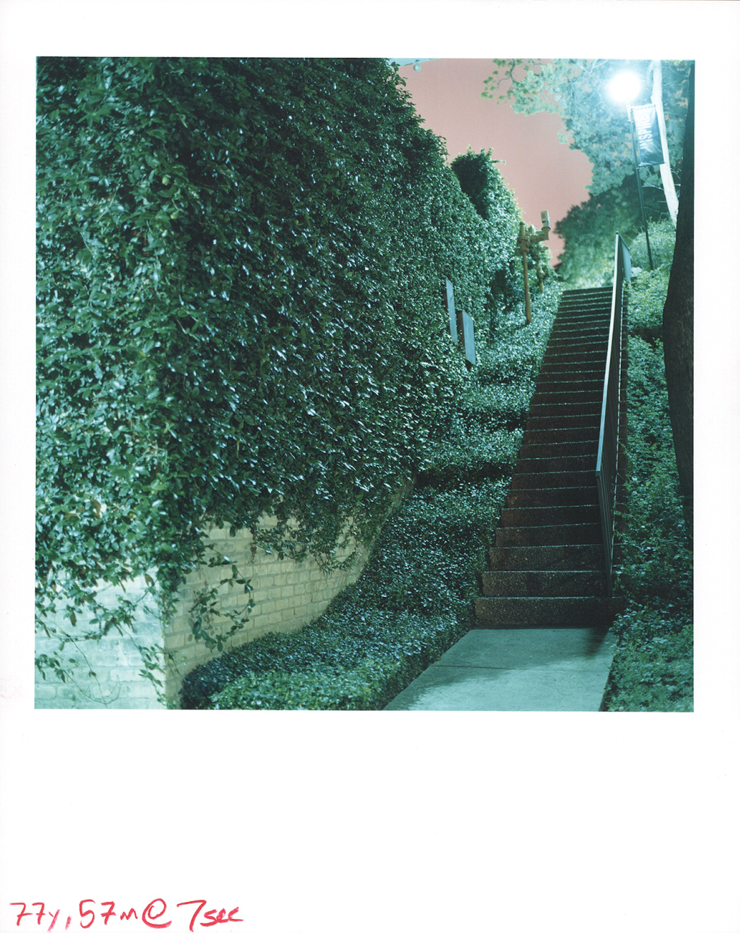
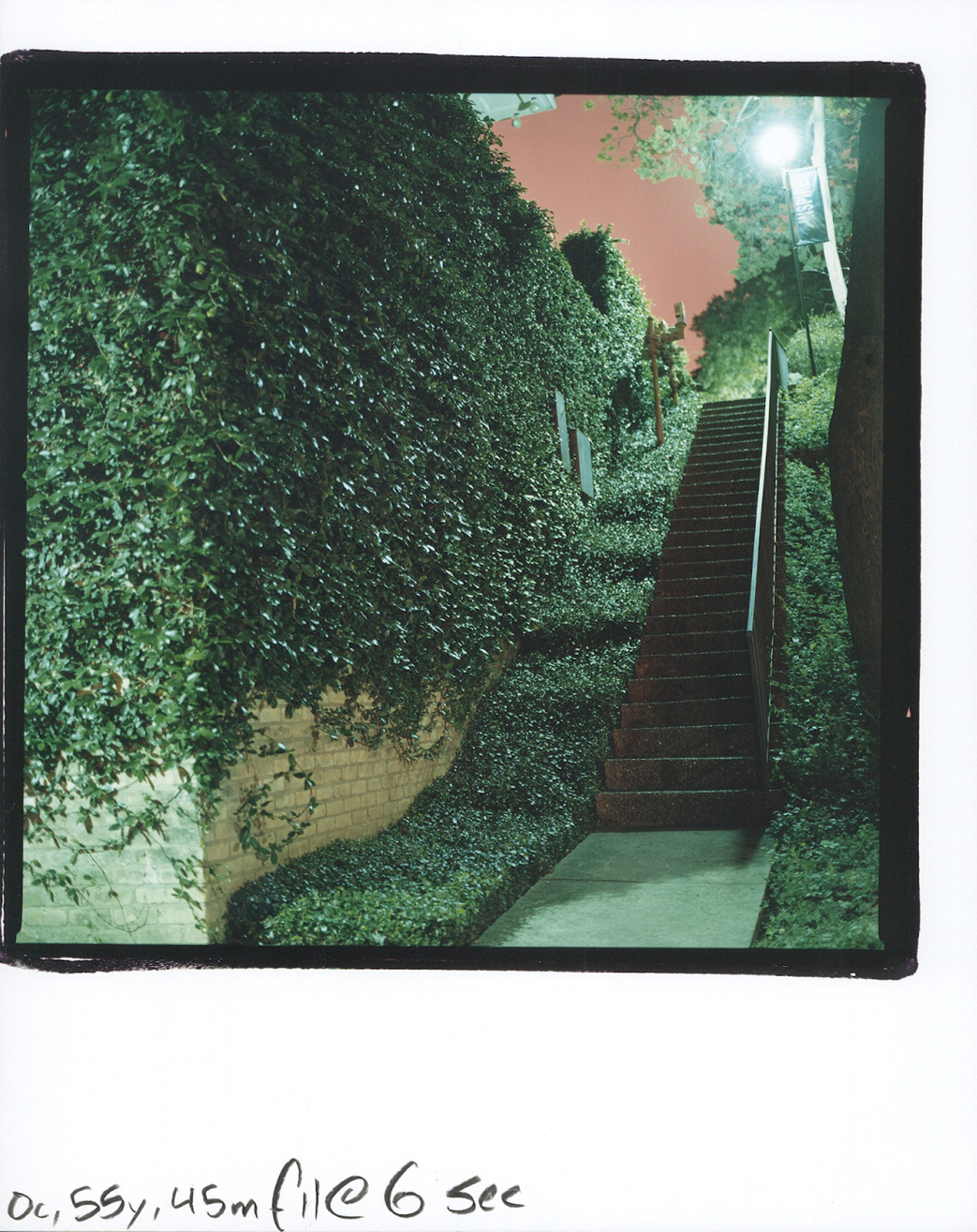
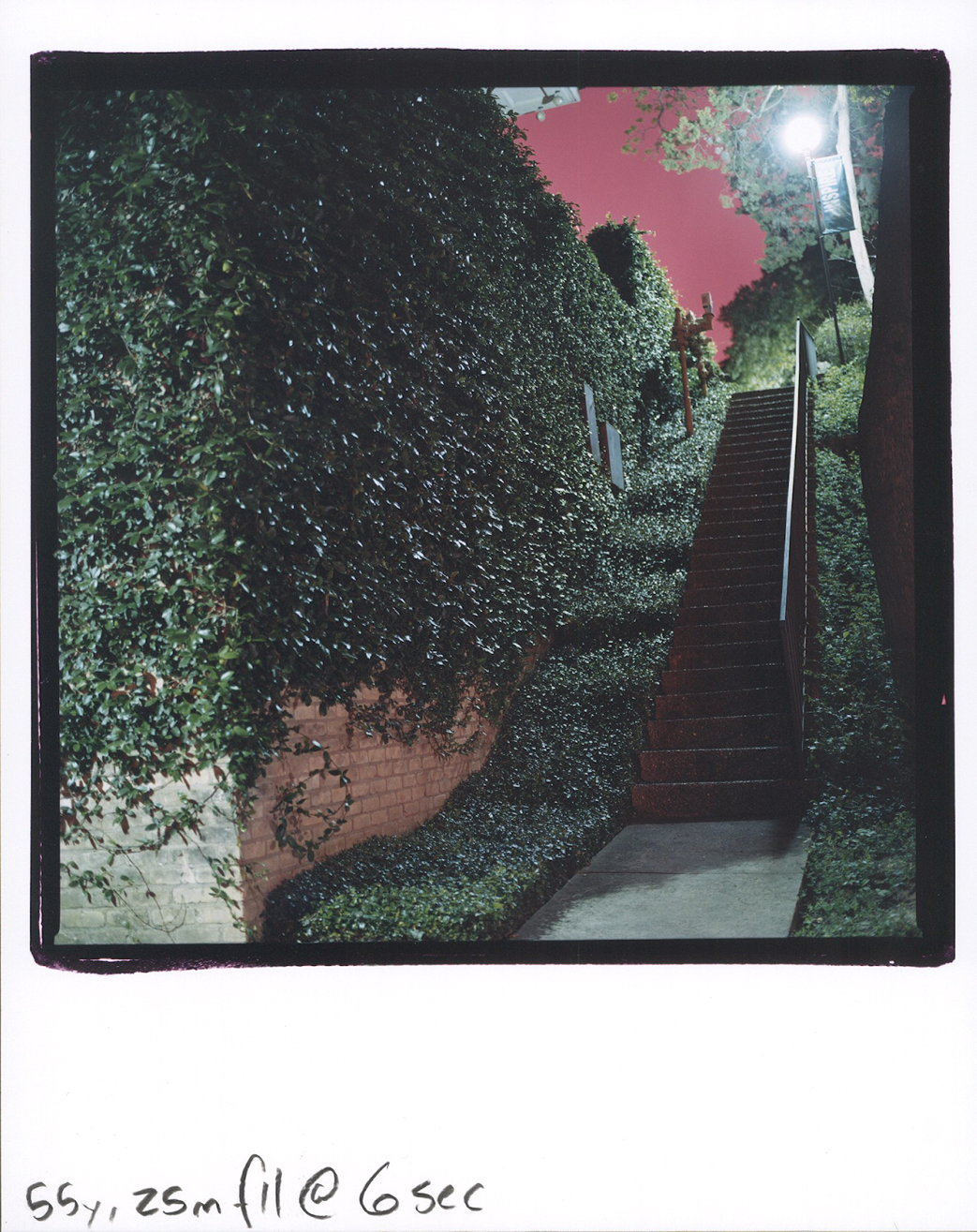
My final presentation came about from an idea that had been tossing around in my head since the beginning of the semester. I had explored death in an abstract, subjective, and ambiguous approach with the first presentation; and a literal, documentary-like approach with the second. With the final presentation however, I wanted to deal with the gradual “death,” or transformation of, an artistic medium: darkroom, or analog photography. While exploring the different ways that I could take this concept, I decided that the printing process and the negative itself should be presented as transparent in order to show some of the unique qualities of darkroom printing. This explains why I used three differently chiseled negative holders to create the frames around each image; pasted the contact sheet cutout onto each print; and left the final formula on the bottom of each print as well. I finally knew where I wanted to take this idea after trying to correct an unnatural color balance in an image, which was caused by a reaction between the combination of sodium vapor lights at night, and daylight balanced film. The sodium vapor lighting produced a toxic green tint on the objects that it illuminated. However, everything that wasn’t affected by the sodium vapor lights remained natural. In analog color printing, if you subtract the filtration (take out, or tone down) of the undesired color, which in this case is green, you end up adding in more of its complementary color, which in this case, is magenta. So then, the image of the staircase and the machine are a result of experimentation with this unique combination of sodium vapor lighting at night, and daylight balanced film. Since there is no “real” way to print these images “correctly,” the final outcome is up to the artist. With the stairway image, I went for making the vine-covered wall appear as neutral as possible, which made the sky turn blood red. The colors created a feeling that, by walking up that stairway, one would be entering into the end of times. With the machine image, I found a point between the sodium vapor light’s toxic green tint and the blood red sky, to make an air conditioner/water cooler?...feel more like an instrument of death, than whatever the hell it actually is. The image of the chapel however, has no sodium vapor lights in it. (You can actually see a tiny bit through the window) I printed it with a neutral color balance because, first of all, I thought it was a gorgeous image. Most of all, I put this photo in between the other two because I believe it captures this “idealistic vision of the church,” as symbolizing the only way to achieve “everlasting life.” (Which is a belief that’s deeply engrained in our culture) During my presentation, I wasn’t able to explain my idea like I wanted to, but that’s what the website’s for… So the last point that I want to drive in; is that I could’ve created the exact same images (frames and all) digitally. The problem that I have with digital photography is that in some cases, it only mimics analog methods of printing. When you shoot digitally, there is no actual negative made up of silver halide crystals on celluloid, that group together when exposed to light, which form to create a reversed representation of what was photographed… (You get the point) Digital is only a long sequence of ones and zeros that form to represent an image. I will end by telling you that I know that I’m biased towards analog photography for various personal reasons. (The biggest being that I am totally amazed by how traditional photography originated, how it was developed into an art form, and completely changed the way we see the world, etc…(The whole chemical process is by far my favorite human innovation)) Ultimately though, I’m all for using whatever tools/technology available to the artist that enables him/her the freedom to express their ideas. That’s why any medium (even digital photography) when done originally and creatively, has the capacity to blow me away and change the way we see our world. finding the right color: the process (the final print is above) |
||


