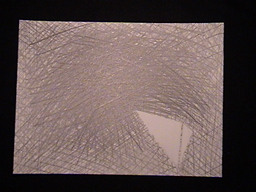
 #1
- The idea here was to show the part of the model that i wanted to retreat into
like the painting. The white space was where I lingered while the rest of the
peice remained a tangle of lines. Also, the class conversation on what influences
an artist's work made me want to give the impression of a heaviness and confusion
pressing down on the clear, open spaces.
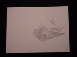 #2
- I decided that i should pare down the abstraction, but only represented the
shadows acst on the model. here i made no distinction between the darkness of
the shadows or their distance form where I sat to draw.
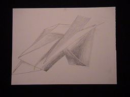 #3
- Re-reading the prompt, i decided to include the positive space in my exploration
of the shadows which i perceived to be negative space serving as a visible reminder
of what does and what does not have mass.
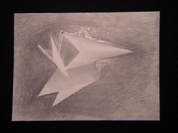 #4
- Disappointed with #3, I tried to give different values to things further away
from my vantage point, with the plane on which the model sat being the darkest.
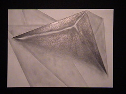 #5
- Bored with restricting my drawings to include the entire model (or rather,
aspects of the model which did not extend past the edge of the page) and the
approach to negative space i was using, I held the model up to the light and
decidd to make the crack betwen the different planes where they did not meet
up perfectly the focus of the next drawing. here, the positive space is represented,
but a tiny sliver of negative space comands the peice.
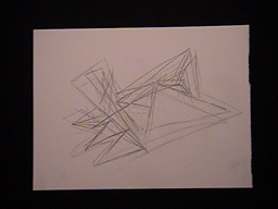 #6
- This drawing is a move away from my tendency to try too hard to be neat and
perfect. The goal was to capture the esssence of what i had hoped my model would
do, force the eyes to move along lines without settleing anywhere--an affect
I felt when looking at Mondrian's "Broadway Boogie Woogie."
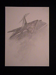 #7
- Next came an exploration of the value of the shadows cast with the light coming
frm up and behind so the shadows stretched towards me.
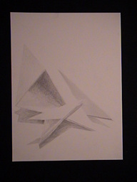 #8
- Another shadow study, this time i let my perfectionist tendencies take hold
once again, giving a dull polish to the drawing.
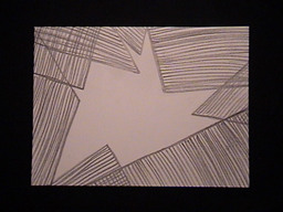 #9
- Here is an attempt to break away from everything else I had previously done.
I drew a silohuette of the model and absrtact lines where the model was not.
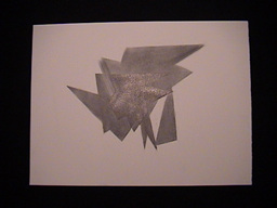 #10
- Intrigued by the shape of the silohuette, I sat the model down on my paper
and traced the edge pf tje shadows cast by two seperate light sources simultaneously.
Then, i removed the model and filled in the shaded areas. The darker shadows
were actually created due to the difference between the less-directed overhead
light and the more concentrated shados caused by the other light.
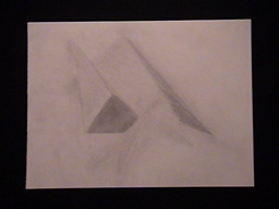 #11
- Searching for a new combination, I tried to use different textures for each
plane I drew. i hated the result. Then I smudged it all with my fingers and
partially erased portions to re-shade with hopes of improving the overall effect.
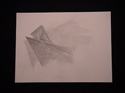 #12
- This is one last attempt to play with the texture created by lines. The lines
are (slightly) darker the further away the plane from where I drew. The lines
run along the depth or z) azis.